Cafe : Opinion

 Amazon, SpaceX And Others Are Arguing That The NLRB Is Actually Unconstitutional
The government agency has protected labor rights since 1935.

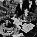
 Employees Have A Right To Show BLM Support On The Job After Historic Labor Board Decision
This right persists even if the messaging arguably has political connotations that some workers or customers might disagree with.
 The Xenophobic Conspiracy Theories Behind The Great Replacement Theory
These false ideas promulgated the spread of white supremacy, which has contributed to terrorist attacks, state violence and propaganda campaigns in the U.S and parts of Europe.

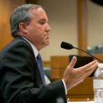
 Texas v. Garland: Another Attack On Women And Democracy From A Radical Judiciary
Last week, the Trump-appointed judge serving serving the Northern District of Texas granted a permanent injunction blocking the federal government from enforcing the Pregnant Workers Fairness Act against the state of Texas.
 Ben Shapiro’s Hip-Hop Hypocrisy And White Male Grievance Lands Him On Top Charts For A Brief Moment
It’s not the first time blatant racism has propelled an artist to the top of music charts.